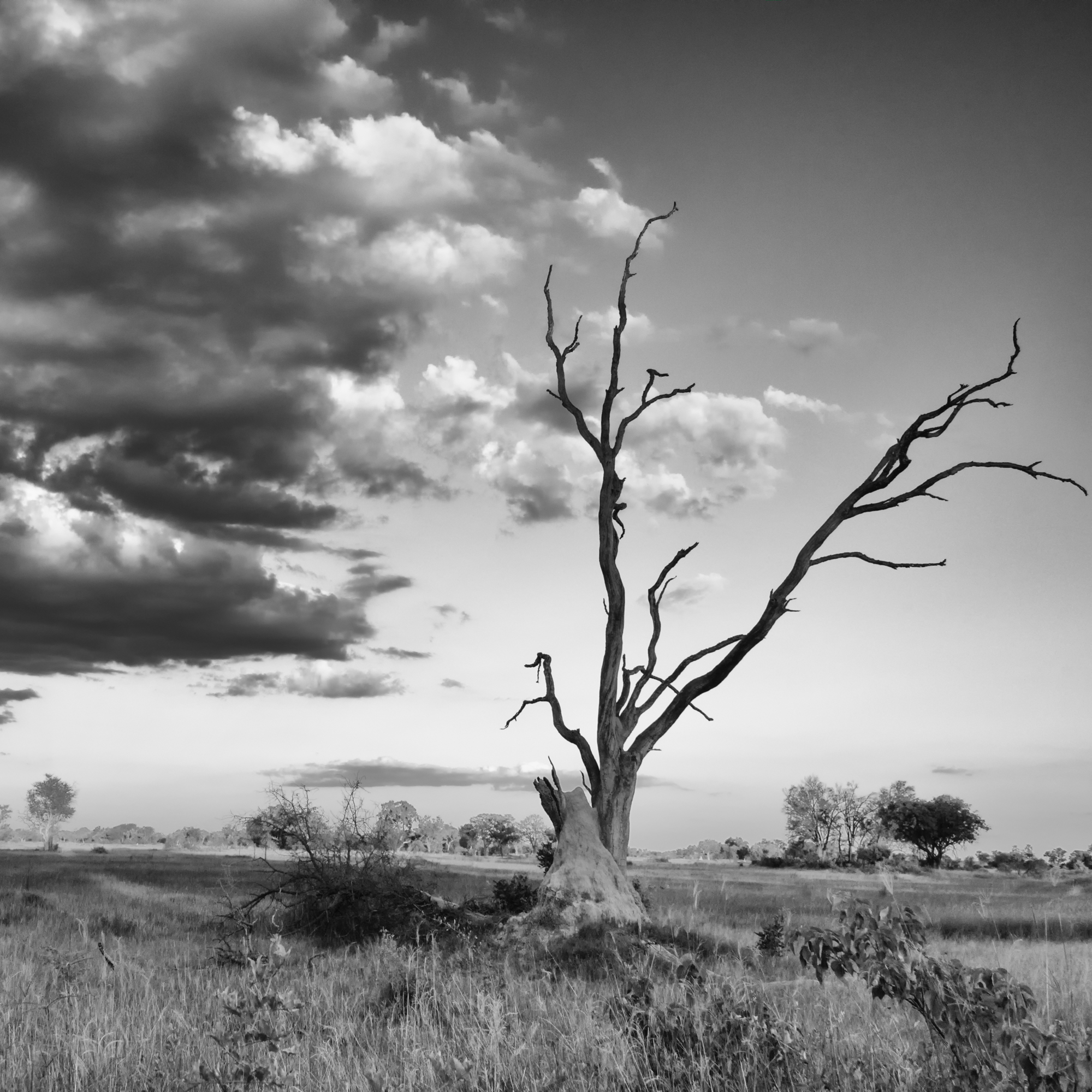
2015-12-21: Monochrome Monday

I had a few photos of trees and branches against a brilliant blue sky, so I thought I would see what they looked like with some different monochrome edits.

My personal favourite is the one in the middle.
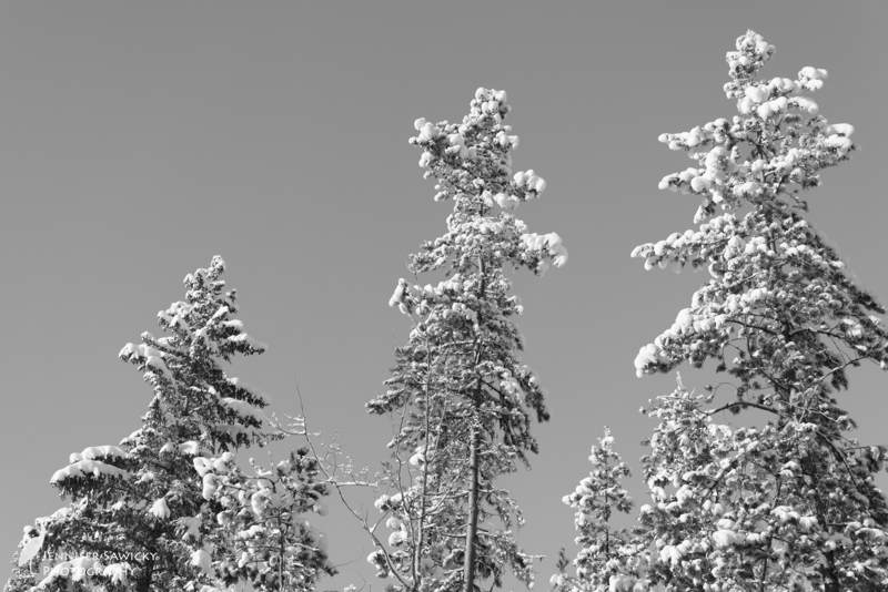
20151221_Monochrome Monday-3
A neutral to high key approach…maybe a 6.5/10 on the brightness scale.
20151221_Monochrome Monday
A low key take on tree branches
20151221_Monochrome Monday-2
Selenium tinted during B&W processing


0 Replies to “2015-12-21: Monochrome Monday”

  1. I like the last one. It implies change. It’s fun to play with different features. I once did a post that showed a coffee shop trough several different modes. Big fun

    1. Hi there – yes we have about 9-10 inches where I’m at, in Prince George. I know they’ve had a few flurries on the coast, but nothing too bad. From what I’ve gathered from the locals here, the snow came much later than normal. It’s been sunny a lot so no complaints from me, it looks beautiful and the city can deal with the roads to keep things manageable, unlike the Vancouver area that always seemed paralyzed after a few flakes!

  2. I agree with Thorsaurus – the last one is my favorite, too. All three are good pictures; but I think the last one manages to capture the best elements of the preceding pictures. In the first picture, you have the advantage of more than one tree in your composition, giving the viewer more to look at. The contrast on the trees also makes the picture interesting. In the second picture, the composition isn’t quite as interesting; but the contrast is better (although to some extent, the black sky in the background swallows some of the contrast). In the third picture, you have three trees again as the subject, with really good contrasts. The sky, as opposed to the first and second pictures, has a subtle variation that not only makes the contrasts in the trees snap, it makes the background interesting without overloading the picture or making it too busy. I also like the composition in the third image better than in the first, as you off-centered the middle tree a bit more 🙂

    1. Thank you very much! I appreciate the feedback and what you like in each of the images. Most of the time I just go with a gut feeling of what I like and don’t like; getting to the why part and articulating it is something I don’t spend enough time on. It reminds me of critique day in some of my classes, which I must say I miss.
      Thanks for stopping by, have a great day.

Leave a Reply

Your email address will not be published. Required fields are marked *

error: Content is protected !!